Case Study · Static Ad Images
Score it. Fix it. Re-score it: a real ad from 5 to 88
We took a real KAYAK Paris flight banner — publicly running, pulled straight from the ad library — scored it with AdCortex, and rebuilt it with AI image tools using nothing but the engagement report as the brief. Three rounds later the same offer, same destination, same price went from a 5/100 to an 88/100. Every version and every decision is below.
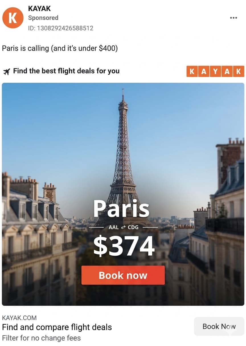 5
5Round 1: a pretty ad that scored 5/100
The original is a perfectly professional banner: Eiffel Tower, "Paris $374", red Book Now button. AdCortex told a different story. The hook grabbed initial attention (57/100 — a dense, detailed image does stop the eye), but by second 4 predicted engagement had collapsed to zero, and the late-window conversion signal sat at 46%. The report's diagnosis: the background is a panorama of thousands of tiny buildings, and the text stack sits directly on top of the busiest part of it. Once viewers finished reading, their eyes wandered into the noise and fatigued — attention was gone before the offer ever registered. This is the classic failure mode we cover in banner ad design: a chaotic image can grab the eye, but it can't keep it.
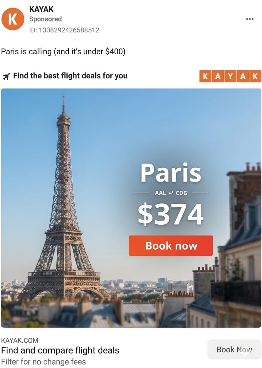 47
47Round 2: recompose with the report as the brief — 47/100
We copied the AI Report, gave it to Gemini alongside the original image, and asked what was happening visually at the drop-off. It mapped the collapse straight to the background clutter and text placement. The first regeneration actually failed — a clean ground-level tower shot with the text placed over the landmark tanked the hook to 24/100, because viewers could no longer categorize the image in the first second. The fix was compositional: Eiffel Tower in the left third, the full text stack moved right onto open sky. Score: 47/100, with the hook recovered and the late window climbing. That failed intermediate round is the most instructive part — without re-scoring, we'd have shipped it, because it looked better than what came before.
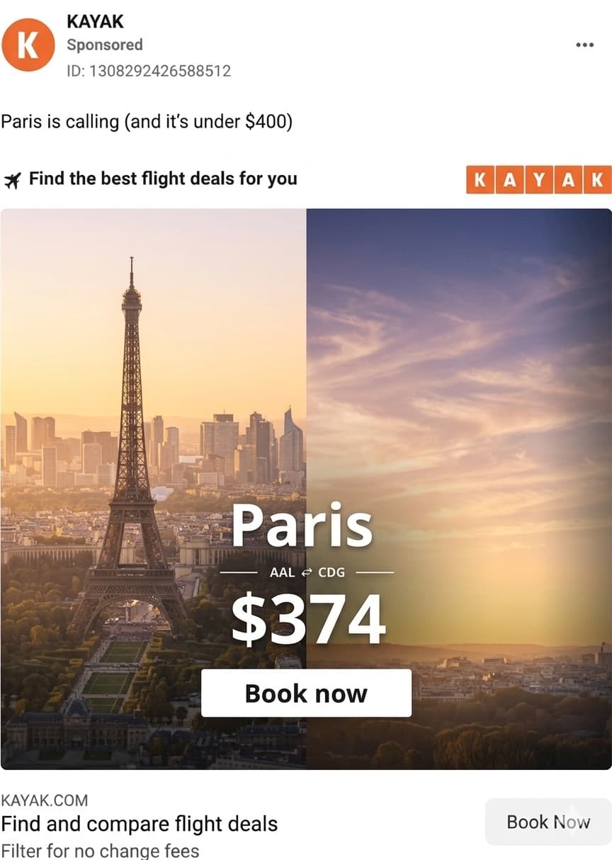 88
88Round 3: remove the last distraction — 88/100
The round-2 report flagged one remaining drop: a dark rooftop cutting into the bottom-right corner was pulling attention off the CTA. The final regeneration replaced it with a warm golden-hour sky in a split-screen composition, and swapped the CTA to a white button for contrast against the sunset. Result: 88/100 overall, late-window signal at 76% (up from 46%), and a perfect 100/100 peak right where the offer lands. Same product, same price, same landmark — the only thing that changed was where the design let attention go.
Why this matters for AI-generated statics
Every redesign here was AI-generated in seconds — the expensive part of this workflow used to be production, and now it's selection. That's the whole argument of the generate-score-regenerate loop: tools like Nano Banana and Midjourney will hand you unlimited polished variations, but polish doesn't predict attention — round 2's failed regen proved that in one image. Scoring is what turns cheap generation into a controlled experiment. The full step-by-step workflow, including the exact prompts, is in the tutorial version of this case study.
Run this loop on your own static ad
Score it, read the report, regenerate, re-score. Most images move meaningfully in two or three rounds.
Score Your Static AdKAYAK is a trademark of KAYAK Software Corporation. This case study analyzes a publicly published advertisement for research and commentary, the same way ad teardown channels do. PreTestAds is not affiliated with, sponsored by, or endorsed by KAYAK, and the redesigned variations shown here are internal test mockups — not ads KAYAK ran.
Frequently asked questions
How was the KAYAK ad rescored from 5/100 to 88/100?
Each round followed the same loop: score the static in PreTestAds, read the engagement report, feed the report and the image to an AI model (Gemini) for a diagnosis, regenerate the creative with an image model, and re-score. Three rounds moved the overall score from 5 to 47 to 88.
What was wrong with the original ad?
The background was a dense city panorama and the text stack sat directly over busy rooftops. The hook grabbed initial attention, but engagement collapsed by second 4 and the late-window conversion signal was only 46% — viewers tuned out before the CTA registered.
Can I run this loop on my own static ads?
Yes. Score your image in PreTestAds, copy the AI Report, give it to a vision-capable AI alongside the image, regenerate with an image model like Nano Banana, Midjourney, or Gemini, and re-score. Each round takes about five minutes; most images improve meaningfully within two or three rounds.